React Scheduler - Fundamentals
The DevExtreme React Scheduler is a component that displays appointments in different layouts. It also allows a user to edit appointments. You can enable each of the CRUD operations separately.
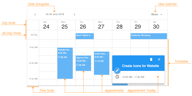
The Scheduler's UI elements include date navigator, view switcher, all-day panel, appointment tooltip, appointment form, and others. The following image illustrates these elements:
The Scheduler adheres to the plugin-based architecture: every feature is encapsulated in a dedicated plugin (or React component).
Basic Setup
The Scheduler displays data specified via the data property. Data objects should have the same structure as the AppointmentModel. You can also extend the objects with custom fields.
The Scheduler requires the following plugins for basic data visualization:
- One of the DayView / WeekView / MonthView - each of them renders a specific appointment layout.
- Appointments - renders appointments.
To specify the date that should be initially displayed in the date navigator and used for calculations, use the ViewState plugin's currentDate option. Otherwise, the widget uses current date.
Customize the Appearance
The Scheduler's visualization plugins provide an API that allows you to customize the appearance of the UI elements.
For example, the WeekView plugin provides properties that you should specify to customize the layout's appearance. The following sample demonstrates how you can implement the timeTableCellComponent and dayScaleCellComponent to highlight current date and weekends. You can use the same approach with any other UI plugin.
Grid
- Getting Started
- Plugin Overview
- Fundamentals
- Controlled and Uncontrolled Modes
- Data Accessors
- Data Formatting
- Sorting
- Paging
- Filtering
- Searching
- Grouping
- Selection
- Editing
- Editing in a Popup Form
- Detail Row
- Editing in Detail Row
- Column Reordering
- Column Resizing
- Column Visibility
- Banded Columns
- Fixed Columns
- Virtual Scrolling
- Lazy Loading
- Tree Data
- Summary Row
- Export
- Localization
- TypeScript Support
- Custom Plugin Development
- Keyboard Navigation
- ColumnChooser
- CustomGrouping
- CustomPaging
- CustomSummary
- CustomTreeData
- DataTypeProvider
- DragDropProvider
- EditingState
- ExportPanel
- FilteringState
- Grid
- GridExporter
- GroupingPanel
- GroupingState
- IntegratedFiltering
- IntegratedGrouping
- IntegratedPaging
- IntegratedSelection
- IntegratedSorting
- IntegratedSummary
- PagingPanel
- PagingState
- RowDetailState
- SearchPanel
- SearchState
- SelectionState
- SortingState
- SummaryState
- Table
- TableBandHeader
- TableColumnReordering
- TableColumnResizing
- TableColumnVisibility
- TableEditColumn
- TableEditRow
- TableFilterRow
- TableFixedColumns
- TableGroupRow
- TableHeaderRow
- TableInlineCellEditing
- TableKeyboardNavigation
- TableRowDetail
- TableSelection
- TableSummaryRow
- TableTreeColumn
- Toolbar
- TreeDataState
- VirtualTable
- VirtualTableState
- createRowCache
Guides
API Reference
Chart
- Getting Started
- Plugin Overview
- Series
- Axes
- Legend and Title
- Stacked Series
- Palette
- Animation
- Hover and Selection
- Tooltip
- Zoom and Pan
- Rotated
- TypeScript Support
Guides
API Reference
Scheduler
- Getting Started
- Fundamentals
- Views
- Appointments
- View Switching
- Date Navigation
- Appointment Tooltip
- Editing
- Resources
- Grouping
- Current Time Indication
- Localization
- TypeScript Support
